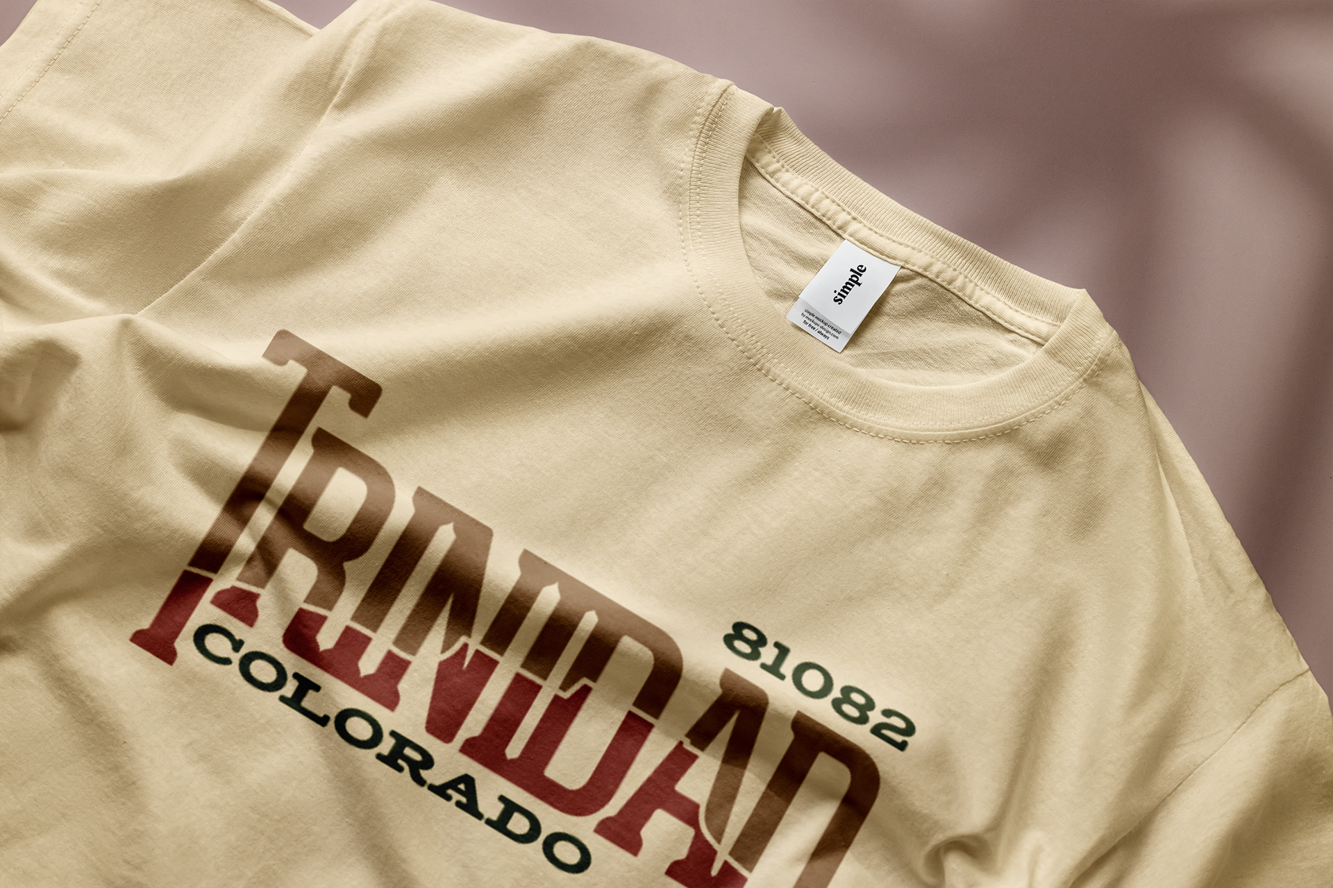


This is a fresh conceptual image makeover for Trinidad, Colorado. The design heavily focuses on typography, using the strength of text to form striking visuals. The silhouette of Fisher's Peak, a famous landmark visible from anywhere in the city, is cleverly integrated into the city's name. The logo employs slab-serif typography and a natural color scheme, which together invoke a sense of nostalgic Western allure. This effectively maintains the historic charm of the town.
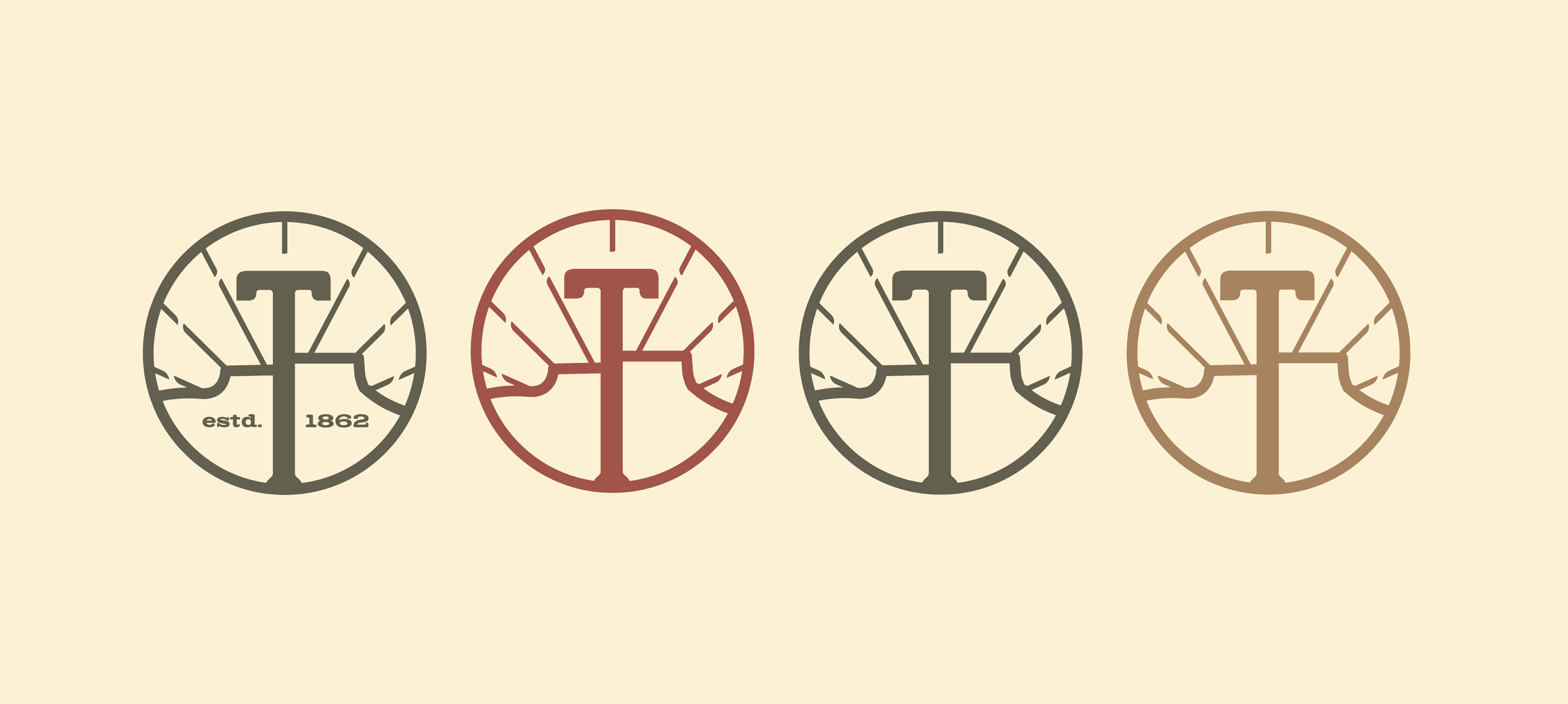
Alongside the full logo mark, I designed an emblem to enhance the adaptability of this brand transformation. An image of Fisher's Peak remains integral to the design, with rays emanating from the central 'T', symbolizing Trinidad's promising future. Equally significant is the design's minimalism, guaranteeing its adaptability across diverse platforms, including print, digital, and architectural signage.
Alongside the full logo mark, I designed an emblem to enhance the adaptability of this brand transformation. An image of Fisher's Peak remains integral to the design, with rays emanating from the central 'T', symbolizing Trinidad's promising future. Equally significant is the design's minimalism, guaranteeing its adaptability across diverse platforms, including print, digital, and architectural signage.